Code your developer portfolio using HTML and CSS

Who doesn't want his own developer portfolio? Everyone does, right? A portfolio is more important than your resume to get a job. But many times, you don't know how to make a good-looking aesthetic portfolio that will get you a job. So let's solve that problem for you.
Table of Contents
- What is a portfolio and why should we even care?
- What we will make
- Header
- NavBar
- Intro section
- Skills
- Projects
- Footer
- Making the site live with the help of GitHub pages
What is a portfolio and why should we even care?
Let's complete the formalities first by answering some questions before we jump on to the coding part!
It is a website that showcases your work, talents, and skills. It advocates for you much better than you do for yourself. Also having a developer portfolio is a must if you are a developer as it is proof of work. Imagine a stationary owner without a pen!
Also, it is a great project to add to your resume. So you can make a portfolio if you run out of project ideas.
What will we make?
You can have a look at my portfolio here. Or, you can also look at the mockup I made using Figma here. We'll code this down and I'll explain every part of it to you. Also, the website will be responsive so you can use it on your phone as well.
Let's code everything down
The code will be available on GitHub so you don't need to worry if you don't get things up. Just do some alterations in the source code and you will be good to go.
Let's break things down into parts and code them down along.
Here's how we will break the portfolio into parts ->
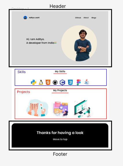
Now let's focus on each part and code that down. I will style things a little first to set the margin and padding to be by default.
Header - HTML
<!DOCTYPE html>
<html lang="en">
<head>
    <meta charset="UTF-8">
    <meta http-equiv="X-UA-Compatible" content="IE=edge">
    <meta name="viewport" content="width=device-width, initial-scale=1.0">
    <title>Portfolio</title>
    <link rel="stylesheet" href="style.css">
    <!-- For Poppins font -->
    <link rel="preconnect" href="https://fonts.googleapis.com">
    <link rel="preconnect" href="https://fonts.gstatic.com" crossorigin>
    <link href="https://fonts.googleapis.com/css2?family=Poppins:wght@200;300;400;500;600&display=swap" rel="stylesheet">
</head>
<body>

</body>
</head>Let's break down the header further
It has -
- A nav bar that contains a logo, name, and a list of links.
- An intro section that contains a photo and a salutation message.
But before that, here is the default CSS for the file is
/* Default CSS */
*{
    padding:0;
    margin:0;
    font-family: "Poppins", sans-serif;
}

.container{
    width: 70%;
    margin: auto;
    padding-top: 50px;
}Let's focus on the nav bar first. The HTML for the NavBar goes like this
<div class="container">
        <div class="small-container">
            <div class="navbar">
                <div class="logo">
                    <a href="index.html"><img src="images/pp.png" alt=""></a>
                    <a href="index.html"><h1>Aditya Joshi</h1></a>
                </div>
                <div class="nav-right">
                    <ul>
                        <li><a href="">About</a></li>
                        <li><a href="">GitHub</a></li>
                        <li><a href="">Blogs</a></li>
                    </ul>
                </div>
            </div>
        </div>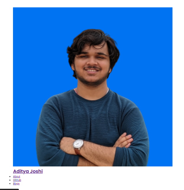
</div>Notice how I wrapped everything into a container div and then a small-container div? This is because container div will occupy only 70% of the space. Just like a book has all the text in the center leaving the margins on the side. And the small div will help in the responsiveness of the website later on.
This is what we shall get by only making the container 70% wide.
Now let's style the NavBar and make this thing look good!
/* NavBar Styling */


/* This is used to
- Flexbox so that we make the display vertical on phone
- Maximise the width to the same as the NavBar div
- Distribute the items to the end
*/
.small-container{
    display: flex;
    width: 100%;
    justify-content: space-between;
}


/* This is used to
- Remove the underline of a link
- Make the font-color black
*/
a{
    text-decoration: none;
    color: black;
}

/* This snippet is used to make the image and name in one line and then to vertically center them */
.logo a{
    display: inline-block;
    vertical-align: middle;
}


/* This is used to -
- Move the name a little far from the IMAGE as it was sticking to it
- Make the image smaller
- Make the image circular
- Vertically align with the text
*/
.logo img{
    margin-right: 15px;
    width: 40px;
    border-radius: 50%;
    vertical-align: middle;
}


/*
This makes the name a little bigger and vertically aligns with the image */
.logo h1{
    font-size: 35px;
    vertical-align: middle;
}

/*
This is used to
- Align with the logo div
- Pad a little for alignment
*/
.nav-right{
    display: inline;
    padding: 10px;
}


/*
This is used to
- Remove the unordered list styling dot
- Make all the points aligned
- Make the text a bit bold
- Space the things a little
- Increast the font size
*/
.nav-right ul li{
    list-style-type: none;
    display: inline;
    font-weight: 400;
    margin-right: 5px;
    font-size: 22px;
}This whole thing makes our Navbar look something like this

Done for the NavBar✅. Let's get to the Intro Section
Intro Section - HTML
<div class="container">
    <div class="introduction">
        <h1 id="salutation">Hi,<br>I am Aditya.<br>A developer from India🇮🇳</h1>
        <img src="images/Untitled design-2.png" alt="" class="my-img">
    </div>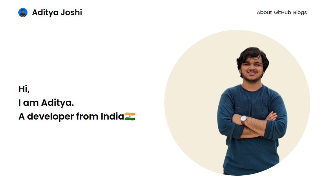
</div>Let's style the intro section and then I'll show you how things work.
/* Introduction */
/* This is used to make the two parts inline and will help in responsiveness */
.introduction{
display: flex;
}
/* This is used to
- Center the text
- Shift the text a little left
- Increase the font-size
*/
.introduction h1{
margin: auto;
margin-left: 0;
font-size: 40px;
}
/* This is used to
- Make the image a bit small
- Make the image circular
*/
.introduction img{
width: 50%;
border-radius: 50%;
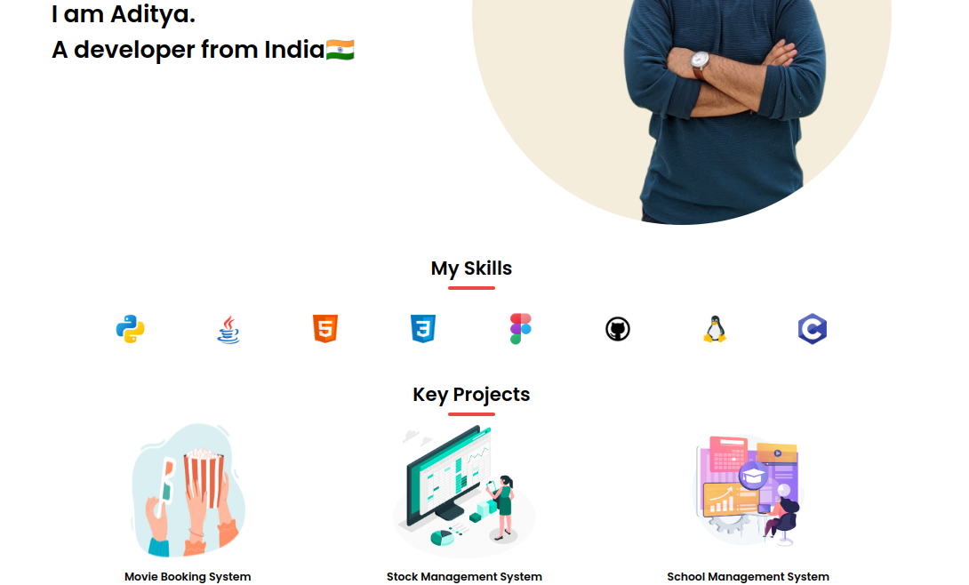
}Now, the website looks something like this
This completes the header for our website! Now let's get onto the skills section. Skills are the most essential part of a portfolio. We shall add it the same way we add it in our GitHub README.
Skills - HTML
Now, this section is pretty dynamic. It totally depends on you what you know and what you don't. So be specific in this part. Follow the below steps to add skills to the images. You can copy the CSS but need to write the HTML yourself.
Download the icon of your Just change the name of the image file with a relevant file in the boilerplate below.
<a href="www.python.org"><img src="images/python-logo.png" alt="Python"></a>Now add this line of code to the list of anchor tags of the skills. So the HTML of the skills section is -
<div class="container">
    <div class="heading">
        <h1>My Skills</h1>
    </div>
    <hr>
    <div class="skills">

        <a href="www.python.org"><img src="images/python-logo.png" alt="Python"></a>
        <a href="www.java.com"><img src="images/java-logo.png" alt="java-logo"></a>
        <a href="https://html.com"><img src="images/html-logo.png" alt="html-logo"></a>
        <a href="https://www.w3.org/Style/CSS/Overview.en.html"><img src="images/css-logo.png" alt="css-logo"></a>
        <a href="www.figma.com"><img src="images/figma-logo.png" alt="figma-logo"></a>
        <a href="www.github.com/adityajoshi-08"><img src="images/github-logo.png" alt="github-logo"></a>
        <a href="www.linuxfoundation.org"><img src="images/linux-logo.png" alt="linux-logo"></a>
        <a href="https://en.wikipedia.org/wiki/C_(programming_language)"><img src="images/c-logo.png" alt="c-logo"></a>
    </div>
</div>Now let's add some CSS to this
/* Skills section */

/* This is used to center align the  */
.heading{
    text-align: center;
}

hr{
    width: 80px;
    height: 6px;
    background-color: #EB4747;
    border: none;
    margin-left: auto;
    margin-right: auto;
    margin-top: 8px;
    border-radius: 25px;
}
.skills{
    margin-top:35px;
    display: flex;
    justify-content: space-evenly;
    flex-wrap: wrap;
}

.skills a img{
    width: 60px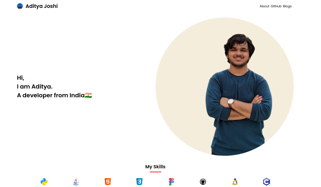
}After the styling, the portfolio looks something like this -
Now, let's get to the second most important part of the portfolio - Projects. Projects are your proof of work and you should include your key projects first. This is the same as skills - dynamic. Add the image by downloading it from any site like unsplash or freepik by searching for your project name. Then change the following boilerplate accordingly. Then append the code into the projects div.
<div class="project">
    <a href=""><img src="images/School Management System.jpg" alt=""></a>
    <h3>School Management System</h3>
</div> Projects - HTML
    <!-- Projects section -->
<div class="container">
<div class="heading">
    <h1>Key Projects</h1>
</div>
<hr>

<div class="projects">

    <!-- Project 1 -->
    <div class="project">
        <a href=""><img src="images/Movie Booking System.jpg" alt=""></a>
        <h3>Movie Booking System</h3>
    </div>

    <!-- Project 2 -->
    div class="project">
        <a href=""><img src="images/Stock Management System.jpg" alt=""></a>
        <h3>Stock Management System</h3>
    </div>

    <!-- Project 3 -->
    <div class="project">
        <a href=""><img src="images/School Management System.jpg" alt=""></a>
        <h3>School Management System</h3>
    </div>
</div>Now let's style the projects section by adding the following CSS -
/* Projects section */


/* This is used to
- Make the display flex that helps in responsiveness
*/
.projects{
    display: flex;
    justify-content: space-around;
    flex: 1;
    flex-wrap: wrap;
}

/*
This is used to
- Align the heading for text in center of each project card
- Make the font light
*/
.project{
    text-align: center;
    font-weight: 200;
}


/*
This is used to adjust the image size
*/
.projects img{
    width: 250px;
    height: 250px;
}After adding everything, our portfolio should look something like this
With this, most of our project is already complete. Now, we just need to add a footer so that it looks good. I didn't have many ideas so just added the "thanks for watching" message.
Footer - HTML
The HTML for the footer goes like this -
<!-- Footer -->
<div class="footer">
    <div class="container">
        <h1>Thanks for watching</h1>
        <a href="index.html">Move to top</a>
    </div>
</div>Let's style the footer a little bit.
Footer - CSS
/* Footer */


/*
This is used to
- Change the background color
- Shift the footer down
- Make the text center aligned
- Change the text color
- Pad up things
- Make the top ends smooth
*/
.footer{
    margin-top: 25px;
    background-color: black;
    text-align: center;
    color: white;
    padding: 75px 75px 25px 75px;
    border-radius: 25px 25px 0 0;
}


/* To change the font and make the heading look bigger */
.footer h1{
    font-size: 50px;
}


/* Removing extra padding from container here for alignment */
.footer .container{
    margin-top: 0;
    padding-top: 0;
}

/* This is used to-
- Change the text color
- Reduce the opacty of text
- Increase the font size
*/
.footer a{
    color: white;
    opacity: 0.8;
    font-size: 25px;
}
You know what? Our website is complete for desktops! Hurray! But we need to make it responsive and optimize it to view on phones. We will do that with the help of media queries. Our work with HTML is done here. Now time for some CSS magic.
Making the website responsive using media queries
We only take one media query for min-width : 480px i.e. phone. The CSS for that is
@media(max-width:780px){
    /* Normal CSS for various parts */
}So the CSS goes like this for various parts
NavBar and the Logo
/* NavBar and the logo*/

 .navbar .small-container{
    flex-direction: column;
     align-items: center;
}

.logo a{
    display: block;
    margin: auto;
}

 .logo a img{
    display: block;
    margin: auto;
}
Introduction
/* Introduction */

.introduction{
    flex-direction: column-reverse;
    align-items: center;
        ext-align: center;
}

.introduction img{
    margin-bottom:15px;
}
So the website is complete. We don't need to apply the media queries to the skills and projects section as we set the flex-wrap to wrap.
So your website is ready to be published now. Congratulations on making your personal portfolio.
Publishing the website on GitHub Pages
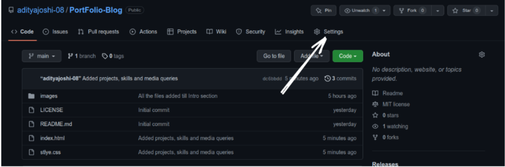
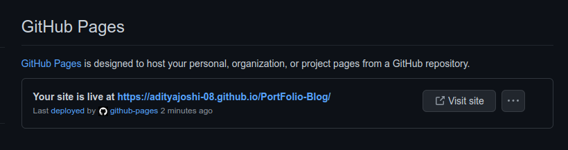
Now since the website is made, we need to publish it somewhere so that we can share a link to the website with the recruiter. Follow the below steps to get it live with the help of GitHub pages for free.
- Push the code to GitHub
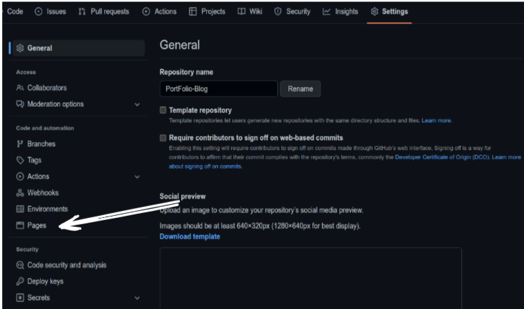
- Go to the settings of the repo page
- Go to Pages
- Deploy from a branch -> main -> Save
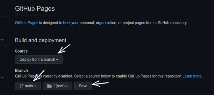
- After some time, GitHub pages will deploy your site and give you a link on the same page like this.
Congratulations on building your portfolio website and deploying it. You can share the link with your friends and show off a little😄😄
The complete source code is available on GitHub. You can access the code here.
This is it for this blog. Thank you so much for reading. See you in the next one!


Member discussion